Tag: research

Supporting SoTL

Scholarly teaching. Education research. Scholarship of Teaching and Learning. These are all activities related to applying valid research methods – typically developed in other disciplines – to study teaching and learning.

For faculty members who’s merit, tenure, and promotion is based, in part, on their research output, publishing articles about education can’t hurt but it may not be seen as important as their disciplinary research. UBC, like a growing number of universities, has a tenure-track stream of Assistant, Associate, and (full) Professor of Teaching. We call it the Educational Leadership stream because success and promotion requires demonstrating impact and leadership beyond your classroom. For faculty in this stream, engaging in SoTL is a powerful way to demonstrate that leadership.

It’s my Centre for Teaching and Learning’s mission to “promote, inspire, and support excellence, leadership, scholarship, and technologies in teaching and learning.” I find supporting scholarship is one of most difficult part of our mission because when we start talking about research, each faculty member immediately snaps to the kinds of disciplinary research they do – if any – and tries to force education into that methodology. I struggle to support them because (i) I don’t know what kind of research they do and (ii) I’m most familiar with research methods found in STEM.

I’m writing this post because something happened last week, something good, that’s changed my approach and, I hope, the success of the faculty members I work with. Here’s the story. Dr. Jasmin Hristov, a research-stream Assistant Professor in the Department of History & Sociology, Irving K. Barber School of Arts and Sciences gave me her permission to tell it.

Professor Hristov teaches upper-level sociology. She plans to bring in a series of guest speakers via video conference and asked if she could use my Centre’s workshop room. “Yes, of course,” I replied. And then, thinking about my Centre’s mission, I added, “You’re doing something innovative – would you be interested in talking about how you could study whether or not it’s effective?” She was, and we met.

First, Professor Hristov described her motivation: introduce the students to six experts from around the World, with careful attention to diversity of gender, race, location, and rank. For each guest speaker, the students do some background reading, prepare questions to ask the speaker, and lead a discussion. After class, the students write a reflection about the experience.

“How can we tell if it was effective? How can we tell if students learned anything?”

We nearly got lost down a dead end. Professor Hristov: “I’ve taught this course before without the video conferencing but with different students and, obviously, without the reflection.” Both of us nearly concluded, “Without a control group to compare grades against, I don’t see how we can study this.”

We didn’t go there, though, because serendipitously, I started the conversation with,

How can we find evidence of impact?

This question opened up whole new ways of thinking, without sending us on that narrow “research = A/B study with statistical significance” path. It led quickly to a couple of possibilities that could produce interesting results that don’t rely on the success or failure of p < 0.05.

Text analysis of students’ reflection

4-page reflection × 6 reflections × 30 students = huge amount of text

Imagine examining all that text with powerful tools like Voyant or NVivo. Will students naturally comment on the diversity of the speakers? That was one of the elements deliberately built into this intervention, recall. Do they need a prompt? Not a heavy prompt like, “Please comment on the diversity of the speakers.” That will only get the answers the students think Professor Hristov wants to hear. Something more subtle, like, um, not sure yet.

But imagine the kind of evidence of impact she could include in the SoTL article:

“I carefully chose the speakers to expose my students to a wide range of races, locations, genders, and ranks. In their reflections, students made the following associations…”

This isn’t cherry-picking an individual student’s comments – that’s a helpful exemplar or supporting anecdote but it’s not evidence. Instead, we have legitimate connections and insight students are making.

Quantitative analysis of reflection grades

Just because we can’t do a controlled A/B study doesn’t mean we can’t do quantitative analysis. Imagine this: imagine we compare the students’ marks on the reflections with their marks on the rest of the course. The reflections are worth around 1/3 of the total mark, so the reflections are worth enough that students will put legitimate care and effort into them. In other words, the reflections are not some incidental marks students can blow off, and they’re not so important that nothing else matters in the course. I made up some data (thx, RANDOM.org) to see what kinds of conclusions we could make (click to enlarge):

Hypothetical student marks on the reflection and other course assignments, with a range of correlations and conclusions about impact. (Data via RANDOM.org. Graphic: Peter Newbury)

The left graph shows there’s a relationship between the students’ success on the reflections and the rest of the course. Do the reflections help them succeed with the other assignments? Do the other assignments help them write better reflections? Can’t tell. Better look at the text analysis…

The center graph isn’t telling a compelling story. Success on the reflections doesn’t seem to have any connection to success on the rest of the course. We can probably conclude the same about what the students are getting out of the video conferences. Time to rethink how the video conferences are integrated and supported.

The right graph is a worst-case scenario: success on the reflections comes at the expense of the their success in the rest of the course. Oh c’mon, this would never happen, right? Well, I’ve seen courses where there’s a “capstone project” that takes all the students’ time. If the capstone is that important, it should probably represent a significant fraction of the overall course mark, so success on the capstone guarantees success in the course. I’ve also seen cases where success on the capstone requires sacrificing the other courses you’re taking – time for the Department Head to get the course instructors together to coordinate their assignments!

No matter the scenario, there’s something here for Professor Hristov to share in the discussion of her SoTL paper. The conclusions will be useful to others thinking about integrating video conferencing into their courses.

Evidence of Impact

This will be my new conversation starter when promoting, inspiring, and supporting scholarship. It’s also a good prompt for the faculty members, themselves, who want to (need to?) demonstrate educational leadership. This prompt invites us to be curious and creative, instead of trying to jam teaching and learning into the same research methods that we’re familiar with from disciplinary research.

Anatomy of a 400-seat Active Learning Classroom

(This is adapted from a poster I presented at the 2018 Society for Teaching and Learning in Higher Education (STLHE) Conference, Université de Sherbrooke, June 20-22, 2018.) Updated 2019 to include the first results of the impact of the design on student success and course instructor teaching strategies (presented at International Forum on Active Learning Classrooms, Minneapolis, MN, 7-9 August 2019.)

(Photo courtesy of Ashlyne O’Neil. Thanks @ashlyneivy!)

Designing a Large, Active Classroom

As class size increases, instructors face an increasingly difficult challenge. There is clear evidence that more students are more successful in classes with active learning.[1] Yet the work required to facilitate active learning – logistics, providing feedback, supporting and interacting with individual students – increases with class size. And despite the importance of the design of learning spaces,[2] large classrooms often impede student-student and student-instructor interactions.

At UBC’s Okanagan campus, I was invited to advise the architects and campus planners on the design a new 400-seat classroom.

Design Principle:
Eliminate everything that hinders
student-student collaboration and
student-instructor interaction.

My poster uses a giant 6-page “book” (you can see it drooping slightly in the center of the poster in the picture above) to highlight different features and characteristics of the design:

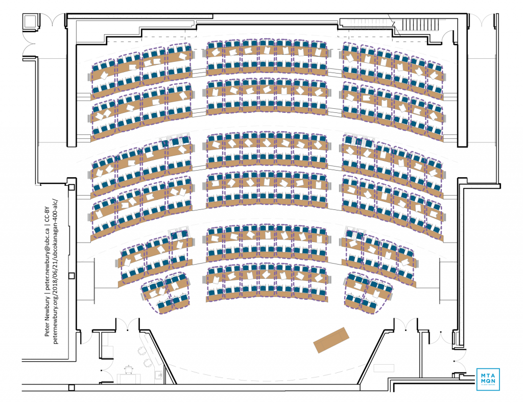
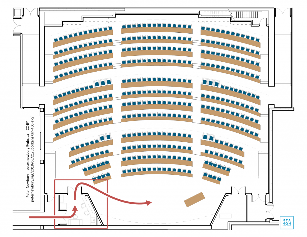
Student flow: Main entrances to the classroom are at the middle of the room. Students flow in and downhill toward the front. Sitting at the back takes deliberate effort. Students can discretely enter and exit without disrupting the class or the instructor.
Main entrances to the classroom are at the middle of the room. Students flow in and downhill toward the front. Sitting at the back takes deliberate effort. Students can discretely enter and exit without disrupting the class or the instructor.
Accessible seating: Fully 20% of seating – roughly 90 locations – are accessible to students using wheelchairs. They can sit in groups with their peers at prime locations, instead of being isolated or confined to designated seats.
Fully 20% of seating – roughly 90 locations – are accessible to students using wheelchairs. They can sit in groups with their peers at prime locations, instead of being isolated or confined to designated seats.
Network of aisles: A network of aisles throughout the classroom allows instructors and teaching assistants to get face-to-face or within arm’s reach of every student. Wireless presentation system allows instructors to teach from any location and project any student’s device.
A network of aisles throughout the classroom allows instructors and teaching assistants to get face-to-face or within arm’s reach of every student. Wireless presentation system allows instructors to teach from any location and project any student’s device.
Group work with whiteboards: Students on narrower front desks swivel around to work with their peers on wider desks. With 150 whiteboards scattered throughout the room, groups can be collaborating within seconds of their instructor saying, “Grab a whiteboard and…”
Students on narrower front desks swivel around to work with their peers on wider desks. With 150 whiteboards scattered throughout the room, groups can be collaborating within seconds of their instructor saying, Grab a whiteboard and…
Lighting: Separate front, middle, back lights create smaller classrooms for 250 and 100 students.
Separate front, middle, back lights create smaller classrooms for 250 and 100 students.
Prep room: Prep room is accessible from outside the classroom so instructors can prepare before and after class. Includes sink, glassware drying rack, storage cabinets, lockable flammable solvent cabinet, fume hood, chemical resistant countertops, first aid kit, demo cart.
Prep room is accessible from outside the classroom so instructors can prepare before and after class. Includes sink, glassware drying rack, storage cabinets, lockable flammable solvent cabinet, fume hood, chemical resistant countertops, first aid kit, demo cart.

Design Features Promote Collaboration and Interaction

Design Features Promote Collaboration and Interaction

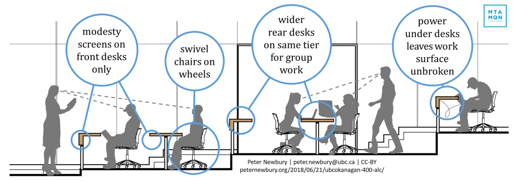
  • The classroom is gently tiered so students farther back can see the front. There are 2 desks on each tier. The front desk is wide enough to hold a notebook and laptop. The rear desk is nearly twice as wide, allowing the front student to swivel around and work with their peers in the rear desk.
  • Swivel chairs on wheels allow students to easily move and work with others around them.
  • The front desk on each tier has a modesty screen. There are deliberately NOT modesty screens on the rear desks, allowing students on the front desk to swivel around to the rear desk without smashing their knees or having to sit awkwardly.
  • There are power outlets for every student under the desktop, leaving the work surface unbroken and smooth for notebooks, laptops, and whiteboards.
  • When the instructor or teaching assistant stands in the aisle in front of the front desk, they can speak face-to-face with the 1st row of students, and are within arm’s reach of the 2nd row. From the aisle on the back of this set of four rows of desks, the instructor or teaching assistant is face-to-face with students in the 4th row and within arm’s reach of the 3rd row.

And here’s what it actually looks like!

(left) Students focus their attention on the front of the room when the instructor is lecturing and writing on the doc cam. (right) At a moment’s notice, students can swivel and gather on the wider, rear desks, grab a nearby whiteboard, and work together.

Optimizing Visibility of the Screen

A slightly curved screen at the front of the classroom is large enough to display two standard inputs. A third projector can display a single image across the screen. The screen is about 7 or 8 feet above the floor, so the instructor at the front does not cast a shadow on the screen or look directly into the projectors (housed in a 2nd floor projection room at the back of the classroom.) The size and curvature of the screen ensure all but the very front-left and front-right seats have views of the screen within UBC’s guidelines.

Here’s what it actually looks like! I’m running two PPT presentations, one through the left projector and through the right, to fill the entire screen with one 32:9 image:

Does the Design Enhance Learning?

We are studying the impact of the design by comparing data collected before and after course instructors teach their courses in the 400-seat classroom, including

  • distributions of final grades and grades on in-class activities like peer instruction (“clicker”) questions and group work sheet
  • drop, fail, withdrawal (DFW) rates
  • locations of the course instructor and teaching assistants at 2-minute intervals throughout the class period
  • what the instructor is doing (lecturing, writing, posing questions,…)  and what the students are doing (listening, discussing peer instruction questions, asking questions,…) using  the Classroom Observation Protocol for Undergraduate STEM (COPUS)3,4

COPUS captures what the instructor and what the students are doing during the class. There is a clear difference here between a traditional, lecture-based course and a course that uses active learning. (Graphic by CWSEI CC BY NC)

Update: Summer 2019

During the Winter 2018, Fall 2018, and Winter 2019 Terms, we used the COPUS protocol to record what John, Steve, and Tamara were doing, and what their students were doing, both in the active learning classroom and in other, more traditional lecture halls.

Spoiler: I was hoping for an obvious uptick in the kinds instructional strategies they facilitated  and increase in students marks when they moved to the active learning classroom. We didn’t find it. And we think we know why: they need to teach for a term in the new classroom to discover what it enables and how they can revise their materials and lesson plans for the next time they teach there.

The COPUS protocol records what the instructors are doing during the class. Here’s what John, Steve, and Tamara do in the traditional lecture halls (blue) and what John and Tamara do the active learning classroom (green). There’s no obvious change in the three most frequent instructional strategies, lecturing, writing on the doc cam, and asking clicker questions.

The COPUS protocol records what instructors are doing in class. These instructors regularly switch between lecturing, writing on the doc cam, and asking clicker questions. They did not appear to change their instructional strategies when they moved to the active learning classroom.

With no significant change in what the instructors are doing, it’s no surprise there’s little change in what their students are doing:

The COPUS protocol records what students are doing in class. In both the traditional and active learning classroom, students spend almost all their time listening to the instructor, problem solving, and discussing clicker questions.

It’s also not surprising that are big changes in students’ final marks. While it’s true physics marks are different than chemistry marks, there are no significant changes in students’ physics marks or students’ chemistry marks between courses taught in traditional lecture halls (blue) and the active learning classroom (green).

While there are differences in final marks between physics and chemistry, neither physics marks nor chemistry marks changed significantly when the courses moved from traditional lecture halls (blue) to the active learning classroom (green).

Conclusions:

  1. Instructors may need to teach for at least one term in the active learning classroom to observe and experience the features that enable more active learning instructional strategies before they make lasting changes to their teaching.
  2. Instructors should get an orientation to the features of the active learning classroom as soon as they’re scheduled to teach there, so they can get a head start on revising how they teach.

Update: Fall 2020

The COVID-19 pandemic has forced all courses online. The active learning classroom, sadly, is quiet and empty. Only a few COPUS observations were made in the Winter 2020 Term before the emergency pivot and no observations have occurred since.


Acknowledgements

My thanks to Dora Anderson, Heather Berringer, Deborah Buszard, Rob Einarson, W. Stephen McNeil, Carol Phillips, Jodi Scott, and Todd Zimmerman for the opportunity to help design to this learning space.

Blueprint and visualizations by Moriyama & Teshima Architects. Used with permission.


References

1 Freeman, S., Eddy, S. L., McDonough, M., Smith, M. K., Okoroafor, N., Jordt, H., & Wenderoth, M. P. (2014). Active learning increases student performance in science, engineering, and mathematics. Proceedings of the National Academy of Sciences, 111(23), 8410-8415. doi.org/10.1073/pnas.1319030111
2 Beichner, R., Saul, J., Abbott, D., Morse, J., Deardorff, D., Allain, R., … & Risley, J. (2007). The Student-Centered Activities for Large Enrollment Undergraduate Programs (SCALE-UP) project, a peer reviewed chapter of Research-Based Reform of University Physics. College Park, MD: Am Assoc of Physics Teachers.
3 Stains, M., Harshman, J., Barker, M. K., Chasteen, S. V., Cole, R., DeChenne-Peters, S. E., … & Levis-Fitzgerald, M. (2018). Anatomy of STEM teaching in North American universities. Science, 359(6383), 1468-1470. doi.org/10.1126/science.aap8892
4 Smith, M. K., Jones, F. H., Gilbert, S. L., & Wieman, C. E. (2013). The Classroom Observation Protocol for Undergraduate STEM (COPUS): a new instrument to characterize university STEM classroom practices. CBE-Life Sciences Education, 12(4), 618-627. doi.org/10.1187/cbe.13-08-0154

The Power of Misconception

“Misconception” is one of those words that makes you slump your shoulders and sigh. It’s not inspiring like “creativity” or “glee.” In fact, in education circles we often resort to “alternate conception” so we’re not starting the conversation at a bad place.

In this post, I want to share with you some beautiful new research on how misconception affects teaching and learning.

In the 6 March 2013 issue of the American Education Research Journal, Philip M. Sadler, Gerhard Sonnert, Harold P. Coyle, Nancy Cook-Smith and Jaimie L. Miller describe “The Influence of Teachers’ Knowledge on Student Learning in Middle School Physical Science Classrooms”. Those of us in astronomy education immediately recognize Phil Sadler. His “A Private Universe” video is must-see for every astronomy instructor, K-12 and beyond.

Here’s what Sadler et al. did in the present study.

They created a 20-question, multiple-choice quiz based on concepts taught in middle school science: properties and changes in properties of matter, motion and forces, and transfer of energy. They chose concepts where kids have a common misconception, for example,

Electrical circuits provide a means of transferring electrical energy when heat, light, sound and chemical changes are produced (with common misconception that electricity behaves in the same way as a fluid.) (p. 12)

With the test in hand, they recruited 100’s of seventh and eighth grade science teachers in 589 schools across the U.S. They asked them to give the test at the beginning, middle and end of the year, to look for signs of learning. By the end of testing, there were matching sets of tests from 9556 students and 181 teachers. In other words, a big enough N that the data could mean something.

By looking at the students’ responses, the authors were able to classify the 20 questions into 2 types:

  • for 8 questions, some students got them right, some got them wrong, with no pattern in the wrong answers. They call these “no misconception” questions.
  • for 12 questions, when students got them wrong, 50% or more chose the same incorrect answer, a carefully chosen distractor. These questions are called “strong misconception” questions.

Sadler et al. also had the students write math and reading tests. From their scores, the students were classified as “high math and reading” or “low math and reading”.

They did something else, too, and this is what makes this study interesting. They asked the teachers to write the test. Twice. The first time, the teachers answered as best they could. Their scores are a measure of their subject matter knowledge (SMK). The second time, the teachers were asked to identify the most common wrong answer for each question. How often they could identify the common wrong answer in the strong misconception questions is the teachers’ knowledge of student misconception (KoSM) score.

With me so far? Students with high or low math and reading skills have pre- and post-scores to measure their science learning gain. Teachers have SMK and KoSM scores.

Do you see where this is going? Good.

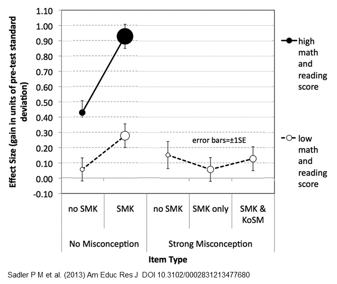
There’s a single graph in the article that encapulates all the relationships between student learning and teachers SMK and KOSM. And it’s a doozie of a graph. Teaching students how to read graphs, or more precisely, teaching instructors how to present graphs so students learn how to interpret them, is something I often think about. So, if you’ll permit me, I’m going to present Sadler’s graph like I’d present it to students.

First, let’s look at the “architecture” of the axes before we grapple with the data.

Let's look at the axes of the graph first, before the data blind us. (Adapted from [1])
Let’s look at the axes of the graph first, before the data overwhelm us. SMK = teachers’ subect matter knowledge; KoSM is the teachers’ knowledge of student misconceptions.  (Adapted from Sadler et al. (2013))
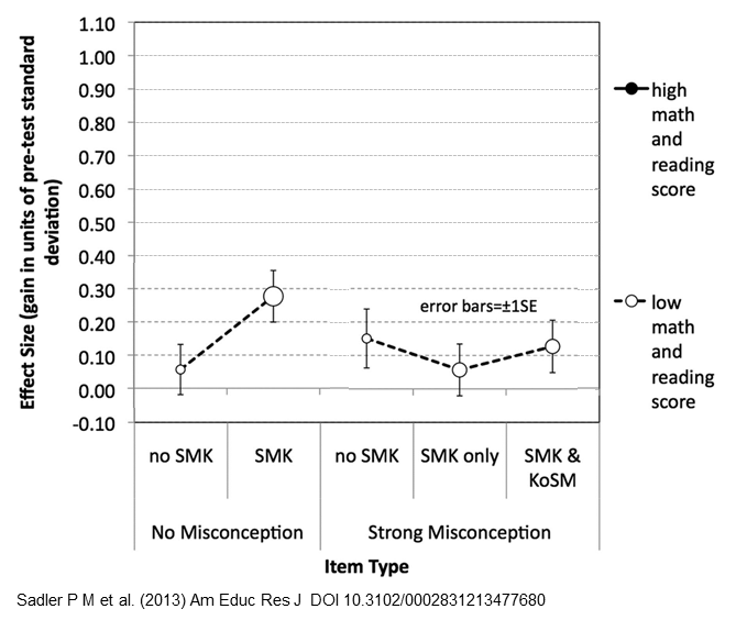
The x-axis give the characteristics of the science teachers (no SMK,…, SMK & KoSM) who taught the concepts for which students show no misconception or strong misconception. Why are there 3 categories for Strong Misconception but only 2 for No Misconception? Because there is no misconception and no KoSM on the No Misconception questions. What about the missing “KoSM only” condition? There were no teachers who had knowledge of the misconceptions but no subject matter knowledge. Good questions, thanks.

Cohens_d_4panel_wikipedia_CCThe y-axis measures how much the students learned compared to their knowledge on the pre-test given at the beginning of the school year. This study does not use the more common normalized learning gain, popularized by Hake in his “Six-thousand student” study. Instead, student learning is measured by effect size, in units of the standard deviation of the pretest. An effect size of 1, for example, means the average of the post-test is 1 standard deviation higher than the average of the pre-test, illustrated in the d=1 panel from Wikipedia. Regardless of the units, the bigger the number on the y-axis, the more the students learned from their science teachers.

And now, the results

This is my post so I get to choose in which order I describe the results, in a mixture of  the dramatic and the logical. Here’s the first of 4 cases:

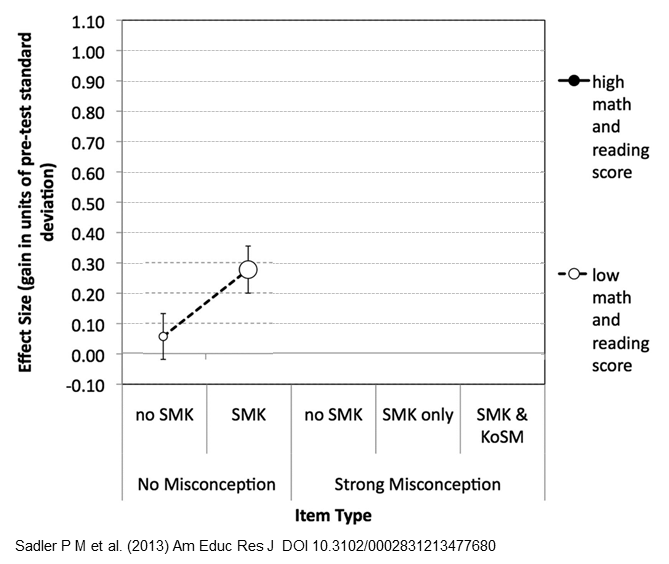
Students who scored low on the reading and math tests didn't do great on the science test, though the ones who had knowledgeable teachers did better. (Graph adapted from Sadler et al. (2013))

The students who scored low on the reading and math tests didn’t do great on the science test either, though the ones who had knowledgeable teachers (SMK) did better. Oh, don’t be mislead into thinking the dashed line between the circles represents a time series, showing students’ scores before and after. No, the dashed line is there to help us match the corresponding data points when the graph gets busy. The size of the circles, by the way, encodes the number of teachers with students in the condition. In this case, there were not very many teachers with no SMK (small white circle).

Next, here are the learning gains for the students with low math and reading scores on the test questions with strong misconceptions:

Students with low math and reading scores did poorly on the strong misconception questions, regardless of the skill of their teachers. (Adapted from Sadler et al. (2013))
Students with low math and reading scores did poorly on the strong misconception questions, regardless of the knowledge of their teachers. (Adapted from Sadler et al. (2013))

Uh-oh, low gains across the board, regardless of the knowledge of their teachers. Sadler et al. call this “particularly troubling” and offer these explanations:

These [strong misconception questions] may simply have been misread, or they may be cognitively too sophisticated for these students at this point in their education, or they many not have tried their hardest on a low-stakes test. (p. 22)

Fortunately, the small size of the circles indicates there were not many of these.

What about the students who scored high on the math and reading tests? First, let’s look at their learning gains on the no-misconception questions. [Insert dramatic drum-roll here because the results are pretty spectaculars.]

Students with knowledgeable teachers exhibited huge learning gains. (Adapted from Sadler et al. (2013))

Both black circles are higher than all the white circles: Even the students with less-knowledgeable teachers (“no SMK”) did better than all the students with low math and reading scores. The important result is how much higher students with knowledgeable teachers scored, represented by the big, black circle just north of effect size 0.9. Science teachers with high subject matter knowledge helped their students improve by almost a full standard deviation. Rainbow cool! The large size of that black circle says this happened a lot. Double rainbow cool!

Finally we get to the juicy part of the study: how does a teacher’s knowledge of the students’ misconceptions (KoSM) affect their students’ learning?

Subject matter knowledge alone isn't enough. To get significant learning gains in their students, teachers also need knowledge of the misconceptions. (Adapted from Sadler et al. (2013))
Subject matter knowledge alone isn’t enough. To get significant learning gains in their students, teachers also need knowledge of the misconceptions. (Adapted from Sadler et al. (2013))

Here, students with knowledgeable teachers (I guess-timate the effect size is about 0.52) do only slightly better than students with less knowledgeable teachers (effect size around 0.44). In other words, on concepts with strong misconceptions, subject matter knowledge alone isn’t enough. To get significant learning on these strong misconception concepts, way up around 0.70, teachers must also have knowledge of those misconceptions.

Turning theory into practice

Some important results from this ingenious study:

  • students with low math and reading skills did poorly on all the science questions, despite the knowledge of their teachers, once again demonstrating that math and reading skills are predictors of success in other fields.
  • Teachers with subject matter knowledge can do a terrific job teaching the concepts without misconceptions, dare we say, the straightforward concepts. On the trickier concepts, though, SMK is not enough.
  • Students bring preceptions to the classroom. To be effective, teachers must have knowledge of their students’ misconceptions so they can integrate that (mis)knowledge into the lesson. It’s not good enough to know how to get a question right — you also have to know how to get it wrong.

Others, like Ed Prather and Gina Brissenden (2008), have studied the importance of teachers’ pedagogical content knowledge (PCK). This research by Sadler et al. shows that knowledge of students’ misconceptions most definitely contributes to a teacher’s PCK.

If you use peer instruction in your classroom and you follow what Eric Mazur, Carl Wieman, Derek Bruff and others suggest, the results of this study reinforce the importance of using common misconceptions as distractors in your clicker questions. I’ll save it for another time, though; this post is long enough already.

Epilogue

Interestingly, knowledge of misconceptions is just what Derek Muller has been promoting over at Veritasium. The first minute of this video is about Khan Academy but after that, Derek describes his Ph.D. research and how teachers need to confront students’ misconceptions in order to get them to sit up and listen.


If you’ve got 8 more minutes, I highly recommend you watch. Then, if you want to see how Derek puts it into practice, check out his amazing “Where Do Trees Get Their Mass From?” video:

Update 6/6/2013 – I’ve been thinking about this paper and post for 3 months and only today finally had time to finish writing it. An hour after I clicked Publish, Neil Brown (@twistedsq on Twitter) tweeted me to say he also, today, posted a summary of Sadler’s paper. You should read his post, too, “The Importance of Teachers’ Knowledge.” He’s got a great visual for the results.

Another Update 6/6/2013  – Neil pointed me to another summary of Sadler et al. by Mark Guzdial (@guzdial on Twitter) “The critical part of PCK: What students get wrong” with links to computer science education.

Navigation