When it comes to course design, I’m a big fan and advocate of Wiggins & McTighe-style backward design: identify learning outcomes, create summative and formative assessments, select instructional strategies.

I like this diagram because
- the loop suggests iteration: you design, teach, assess, redesign, reteach,…
- the arrows are double-ended: a novel assessment might allow me to aim for a higher learning outcome and force me choose a new instructional strategy, and so on
The last 2+ years have highlighted the importance of learning management systems and other learning technologies. They don’t just enable assessment and instruction, they can enhance it. Like, say, choosing Slido to run peer instruction (aka clickers) instead of think-pair-share.
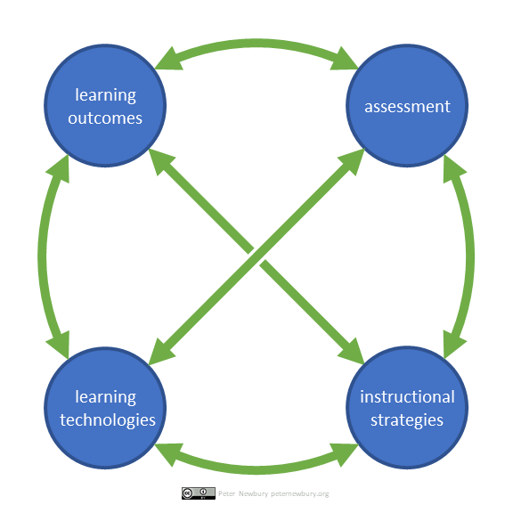
So, I want to add “learning technologies” to the design process. A novel technology (like, say, Perusall) might allow me to raise the level of the learning outcome, requiring a different assessment and instructional strategy. Let’s add it to the loop:

Uh-oh! If I just add another circle to the loop, I loose important connections, like how the learning outcome helps me select the instructional strategy, and how the assessment might rely on the capability of the learning management system. There’s an easy fix, of course.
Adding two missing arrows brings back the message that changing one component has consequences on the other three.

This is the version of backward design plus learning technologies I’ll be using when talking with course instructors. Until I iterate and revise, of course!
End notes
- This post first appeared as a thread on Twitter. Probably a good idea to back it up here, just in case.
- Part of my motivation for sharing these diagrams is the opportunity to practice using alternative text (alt txt), the written description that accompanies images posted on the web and Twitter. I’ve been learning a lot about alt txt from Ann Gagné @AnnGagne, Jorts @JortsTheCat (who always includes simple, clear, and wonderfully creative alt txt), and this excellent webinar “What is alternative text? How do I write it for images, charts, and graphs?” by Matthew Deeprose @VLEguru.
- I use PowerPoint to create simple diagrams like these. I like the auto-align features, the fine-control over the size of objects (down to 0.01 inches), and the easy “Duplicate slide” tool (I add new elements to copies of the slide so I can go back or try different options.) A new trick for these diagrams: I started with a custom 6″ x 6″ slide. “Save as PNG” pumped out a folder of identically sized (576 x 576 pixel) PNGs so I didn’t have to do any cropping.


