Category: interpreting graphs

The Power of Misconception

“Misconception” is one of those words that makes you slump your shoulders and sigh. It’s not inspiring like “creativity” or “glee.” In fact, in education circles we often resort to “alternate conception” so we’re not starting the conversation at a bad place.

In this post, I want to share with you some beautiful new research on how misconception affects teaching and learning.

In the 6 March 2013 issue of the American Education Research Journal, Philip M. Sadler, Gerhard Sonnert, Harold P. Coyle, Nancy Cook-Smith and Jaimie L. Miller describe “The Influence of Teachers’ Knowledge on Student Learning in Middle School Physical Science Classrooms”. Those of us in astronomy education immediately recognize Phil Sadler. His “A Private Universe” video is must-see for every astronomy instructor, K-12 and beyond.

Here’s what Sadler et al. did in the present study.

They created a 20-question, multiple-choice quiz based on concepts taught in middle school science: properties and changes in properties of matter, motion and forces, and transfer of energy. They chose concepts where kids have a common misconception, for example,

Electrical circuits provide a means of transferring electrical energy when heat, light, sound and chemical changes are produced (with common misconception that electricity behaves in the same way as a fluid.) (p. 12)

With the test in hand, they recruited 100’s of seventh and eighth grade science teachers in 589 schools across the U.S. They asked them to give the test at the beginning, middle and end of the year, to look for signs of learning. By the end of testing, there were matching sets of tests from 9556 students and 181 teachers. In other words, a big enough N that the data could mean something.

By looking at the students’ responses, the authors were able to classify the 20 questions into 2 types:

  • for 8 questions, some students got them right, some got them wrong, with no pattern in the wrong answers. They call these “no misconception” questions.
  • for 12 questions, when students got them wrong, 50% or more chose the same incorrect answer, a carefully chosen distractor. These questions are called “strong misconception” questions.

Sadler et al. also had the students write math and reading tests. From their scores, the students were classified as “high math and reading” or “low math and reading”.

They did something else, too, and this is what makes this study interesting. They asked the teachers to write the test. Twice. The first time, the teachers answered as best they could. Their scores are a measure of their subject matter knowledge (SMK). The second time, the teachers were asked to identify the most common wrong answer for each question. How often they could identify the common wrong answer in the strong misconception questions is the teachers’ knowledge of student misconception (KoSM) score.

With me so far? Students with high or low math and reading skills have pre- and post-scores to measure their science learning gain. Teachers have SMK and KoSM scores.

Do you see where this is going? Good.

There’s a single graph in the article that encapulates all the relationships between student learning and teachers SMK and KOSM. And it’s a doozie of a graph. Teaching students how to read graphs, or more precisely, teaching instructors how to present graphs so students learn how to interpret them, is something I often think about. So, if you’ll permit me, I’m going to present Sadler’s graph like I’d present it to students.

First, let’s look at the “architecture” of the axes before we grapple with the data.

Let's look at the axes of the graph first, before the data blind us. (Adapted from [1])
Let’s look at the axes of the graph first, before the data overwhelm us. SMK = teachers’ subect matter knowledge; KoSM is the teachers’ knowledge of student misconceptions.  (Adapted from Sadler et al. (2013))
The x-axis give the characteristics of the science teachers (no SMK,…, SMK & KoSM) who taught the concepts for which students show no misconception or strong misconception. Why are there 3 categories for Strong Misconception but only 2 for No Misconception? Because there is no misconception and no KoSM on the No Misconception questions. What about the missing “KoSM only” condition? There were no teachers who had knowledge of the misconceptions but no subject matter knowledge. Good questions, thanks.

Cohens_d_4panel_wikipedia_CCThe y-axis measures how much the students learned compared to their knowledge on the pre-test given at the beginning of the school year. This study does not use the more common normalized learning gain, popularized by Hake in his “Six-thousand student” study. Instead, student learning is measured by effect size, in units of the standard deviation of the pretest. An effect size of 1, for example, means the average of the post-test is 1 standard deviation higher than the average of the pre-test, illustrated in the d=1 panel from Wikipedia. Regardless of the units, the bigger the number on the y-axis, the more the students learned from their science teachers.

And now, the results

This is my post so I get to choose in which order I describe the results, in a mixture of  the dramatic and the logical. Here’s the first of 4 cases:
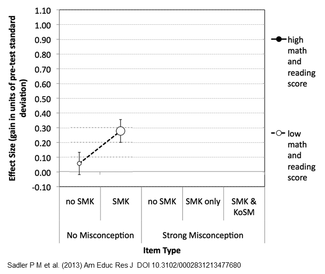
Students who scored low on the reading and math tests didn't do great on the science test, though the ones who had knowledgeable teachers did better. (Graph adapted from Sadler et al. (2013))

The students who scored low on the reading and math tests didn’t do great on the science test either, though the ones who had knowledgeable teachers (SMK) did better. Oh, don’t be mislead into thinking the dashed line between the circles represents a time series, showing students’ scores before and after. No, the dashed line is there to help us match the corresponding data points when the graph gets busy. The size of the circles, by the way, encodes the number of teachers with students in the condition. In this case, there were not very many teachers with no SMK (small white circle).

Next, here are the learning gains for the students with low math and reading scores on the test questions with strong misconceptions:
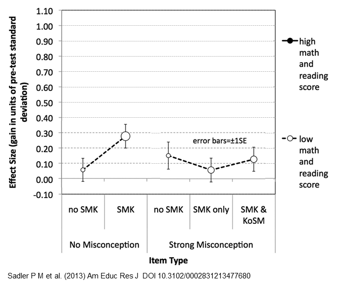
Students with low math and reading scores did poorly on the strong misconception questions, regardless of the skill of their teachers. (Adapted from Sadler et al. (2013))
Students with low math and reading scores did poorly on the strong misconception questions, regardless of the knowledge of their teachers. (Adapted from Sadler et al. (2013))

Uh-oh, low gains across the board, regardless of the knowledge of their teachers. Sadler et al. call this “particularly troubling” and offer these explanations:

These [strong misconception questions] may simply have been misread, or they may be cognitively too sophisticated for these students at this point in their education, or they many not have tried their hardest on a low-stakes test. (p. 22)

Fortunately, the small size of the circles indicates there were not many of these.

What about the students who scored high on the math and reading tests? First, let’s look at their learning gains on the no-misconception questions. [Insert dramatic drum-roll here because the results are pretty spectaculars.]
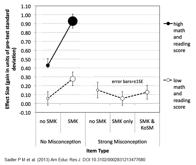
Students with knowledgeable teachers exhibited huge learning gains. (Adapted from Sadler et al. (2013))

Both black circles are higher than all the white circles: Even the students with less-knowledgeable teachers (“no SMK”) did better than all the students with low math and reading scores. The important result is how much higher students with knowledgeable teachers scored, represented by the big, black circle just north of effect size 0.9. Science teachers with high subject matter knowledge helped their students improve by almost a full standard deviation. Rainbow cool! The large size of that black circle says this happened a lot. Double rainbow cool!

Finally we get to the juicy part of the study: how does a teacher’s knowledge of the students’ misconceptions (KoSM) affect their students’ learning?

Subject matter knowledge alone isn't enough. To get significant learning gains in their students, teachers also need knowledge of the misconceptions. (Adapted from Sadler et al. (2013))
Subject matter knowledge alone isn’t enough. To get significant learning gains in their students, teachers also need knowledge of the misconceptions. (Adapted from Sadler et al. (2013))

Here, students with knowledgeable teachers (I guess-timate the effect size is about 0.52) do only slightly better than students with less knowledgeable teachers (effect size around 0.44). In other words, on concepts with strong misconceptions, subject matter knowledge alone isn’t enough. To get significant learning on these strong misconception concepts, way up around 0.70, teachers must also have knowledge of those misconceptions.

Turning theory into practice

Some important results from this ingenious study:

  • students with low math and reading skills did poorly on all the science questions, despite the knowledge of their teachers, once again demonstrating that math and reading skills are predictors of success in other fields.
  • Teachers with subject matter knowledge can do a terrific job teaching the concepts without misconceptions, dare we say, the straightforward concepts. On the trickier concepts, though, SMK is not enough.
  • Students bring preceptions to the classroom. To be effective, teachers must have knowledge of their students’ misconceptions so they can integrate that (mis)knowledge into the lesson. It’s not good enough to know how to get a question right — you also have to know how to get it wrong.

Others, like Ed Prather and Gina Brissenden (2008), have studied the importance of teachers’ pedagogical content knowledge (PCK). This research by Sadler et al. shows that knowledge of students’ misconceptions most definitely contributes to a teacher’s PCK.

If you use peer instruction in your classroom and you follow what Eric Mazur, Carl Wieman, Derek Bruff and others suggest, the results of this study reinforce the importance of using common misconceptions as distractors in your clicker questions. I’ll save it for another time, though; this post is long enough already.

Epilogue

Interestingly, knowledge of misconceptions is just what Derek Muller has been promoting over at Veritasium. The first minute of this video is about Khan Academy but after that, Derek describes his Ph.D. research and how teachers need to confront students’ misconceptions in order to get them to sit up and listen.


If you’ve got 8 more minutes, I highly recommend you watch. Then, if you want to see how Derek puts it into practice, check out his amazing “Where Do Trees Get Their Mass From?” video:

Update 6/6/2013 – I’ve been thinking about this paper and post for 3 months and only today finally had time to finish writing it. An hour after I clicked Publish, Neil Brown (@twistedsq on Twitter) tweeted me to say he also, today, posted a summary of Sadler’s paper. You should read his post, too, “The Importance of Teachers’ Knowledge.” He’s got a great visual for the results.

Another Update 6/6/2013  – Neil pointed me to another summary of Sadler et al. by Mark Guzdial (@guzdial on Twitter) “The critical part of PCK: What students get wrong” with links to computer science education.

The Ups and Downs of Interpreting Graphs

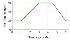
Here’s a graph showing some guy’s position as he’s out for a walk:

This graph shows the position of a guy out for a walk. Can you tell what he's doing?
This graph shows the position of some guy out for a walk. Can you tell what he’s doing?

Take a moment and describe in your own words what he’s doing. If you said, “He went up a hill and down again,” I’m sorry, you’re incorrect. But don’t feel bad – that’s a common answer when you ask this kind of question in a first-year physics class.

Andrew Elby calls it WYSIWYG graph interpretation. Robert Beichner investigates these particular “kinematic graphs” that show distance, velocity and acceleration versus time while this terrific paper by Priti Shah and James Hoeffner reviews this graph-as-cartoon misconception and many others, with implications for instruction.

Almost every instructor in a science, technology, engineering or math (STEM) field,  and many in the Humanities, too, lament their students’ inability to “use graphs”. I sympathize with them. But also with their students: graph interpretation is one of those areas, I believe, where expert-blindness, also called unconscious competence by Sprague and Stewart (2000), is most visible: experts don’t even realize what they’re doing anymore. By the time they’re  standing at the front of the classroom, instructors may have looked at hundreds, even thousands, of graphs. We look at a graph and BAM! we see it’s key idea. I don’t even know how I know. I just…do.

Well, because of the line of work I’m in, I’m forcing myself to slow down and try to reconstruct what’s going on in my head. Task analysis, they call it. When did I read the axis labels? When did I notice their range and scaling? Was that before or after I’d read the title and (especially in a journal) the caption? When you finally get to looking at the data, how do you recognize the key feature – an outlier, the slope of the line, the difference between 2 bars of a histogram – that support the claim?

The ease with which we interpret graphs makes it difficult for us to teach it:

What do you mean it’s a guy going up a hill and down again?! Obviously he’s standing still for the first second – slope equals zero! D’uh!

I’ve been wrestling with this problem for a while. Every time it comes up, like it did this week, I dig out a piece I wrote in 2010 when I was part of the Carl Wieman Science Education Initiative (CWSEI) at the University of British Columbia. It was for an internal website so the version reproduced has been updated and some names have been removed.

Interpreting and Creating Graphs

I was at a 3-day meeting called Applying Cognitive Psychology to University Science Education which brought together science education researchers from the CWSEI in Vancouver and CU-SEI in Boulder and the Applying Cognitive Psychology to Enhance Educational Practice (ACPEEP) Consortium (or “star-studded” consortium, as CU-Boulder’s Stephanie Chasteen describes it.)

The skill of interpreting graphs came up a number of times. On the last day of the meeting, a group of us sat down to think about what it means to use a graph. One of us brought up the “up a hill and down again” interpretation of graphs in physics. An oceanographer in the group said she’d like to be able to give her students a complex graph  like this one and ask them to tell her what’s going on:

Vostok Petit data
Graph of CO2 (Green graph), temperature (Blue graph), and dust concentration (Red graph) measured from the Vostok, Antarctica ice core as reported by Petit et al., 1999. (Image and caption via Wikimedia Commons)
(Psst – how long did it take you to spot the 100,000-year cycle in the C02 levels? Not very long? How did you do that?) After thinking about the skills we ask our students for, a colleague sketched out a brilliant flow chart that eventually evolved into this concept map about graphing:


"Using graphs" means creating a graph (red arrows) and extracting information from a graph (green arrows).
“Using graphs” can mean drawing a graph (green arrows) or getting information from a graph (red arrows).

We see the information flowing inwards to create a graph and information flowing outwards to interpret a graph.

Creating a graph

Students should be able to use words and stories, mathematical models and equations, and numbers/data to create a graph. All of this information should be used to select the graph type – time series, histogram, scatter plot, y vs x, etc. – based on what we want to use the graph for, the type of data and what best tells the story we want to tell. Once selected, a useful graph should have

  • axes (for given variables, for combinations of variables that produce linear relations) with scale, range, labels
  • uncertainty, if applicable
  • visible and accurate data
  • title, legend if necessary
  • for graphs of functions, in particular, the graph includes (and is built from) characteristics of the function like asymptotes, intercepts, extreme points, inflection points

An instructor could assess a student’s graph with a graphing rubric with criteria like

  1. Does the graph have appropriate axes?
  2. Are the data accurately plotted?
  3. Does the graph match the characteristics of the function f(x)?
  4. and so on

The paper by Priti Shah and James Hoeffner reviews research into what people see when they look at a graph. It provides evidence for what does (and doesn’t) work. For example, if a graph shows the amount of some quantity, the amount should be the vertical axis because people see that as the height of the stack. On the other hand, if the graph is about distance traveled, distance should be the horizontal axis because that’s how people travel. One of my favourite snippets from Shah and Hoeffner: “When two discrete data points are plotted in a line graph, viewers sometimes describe the data as continuous. For example, a graph reader may interpret a line that connects two data points representing male and female height as saying, ‘The more male a person is, the taller he/she is’.” (p. 52) Their finding, as they say, have “implications for instruction.”

Interpreting a graph

More often in our Science classes, we give students a graph and ask them to interpret it. This is a critical step in figuring out and describing the underlying (that is, responsible) process. Just what is it we want students to do with a graph?

describe Describe in words what the graph is showing:

Given two distance vs time graphs, which person is walking faster?

What is happening here?

How have the CO2 levels changed over the last 400 000 years? [And we’ll save “why has it been doing that?” for the next question.]

interpolate and predict Use the mathematical model or equation to extract values not explicitly in the data:

Give the graph of a linear function and ask for the expected value of another (the next) measurement.

Give the graph, ask for the function y=f(x)

Find the slope of the graph

read off data Extract numbers already present in the data:

What is the value of y for a given x?

In what years did the CO2 levels reach 280 ppmv?

When is the man farthest from the starting point?

Join the discussion

I’m always looking to collect examples of graphs—the ones students in your discipline have trouble with. It’s very likely we’re having similar issues. Perhaps these issues could someday be addressed with a graphing concept inventory test that expand’s on Beichner’s Test of Understanding Graphs in Kinematics (TUG-K).

[Update: Just prior to publishing this piece, I looked more closely at the “guy out for a walk” graph. He travels 40 m in 2 seconds – that’s 20 metres per second or 20 x 3600 = 72 000 m per hour. Seventy-two km/h? He’s definitely not walking. Perhaps I should have said, “Here’s a graph showing some guy out for a drive.” I’ll stick with the original, though. Yeah, maybe I did it on purpose, just to make you put up your hand and explain your answer…]

References

  1. Elby, A. (2000). What students’ learning of representations tells us about constructivism. Journal of Mathematical Behavior 19, 4, 481-502.
  2. Beichner, R.J. (1994). Testing student interpretation of kinematics graphs. Am. J. Phys. 62, 8, 750-762.
  3. Shah, P. & Hoeffner, J. (2002). Review of Graph Comprehension Research: Implications for Instruction. Educational Psychology Review 14, 1, 47-69.
  4. Sprague, J., Stuart, D. & Bodery, D. (2013). The Speaker’s Handbook (10/e). Boston: Wadsworth, Cengage Learning.

A misconception about extrasolar planets

A couple of weeks ago in the introductory “Astro 101” class I work in, the instructor and I confirmed that many students hold a certain misconception. I was, still am, pretty excited about this little discovery in astronomy education. If my conversations over the following few days had turned out differently, I probably would be writing it for publication in the Astronomy Education Review. Maybe I still will. But for now, here’s my story.

Our search for life in the Universe and the flood of results from the Kepler Mission have made the discovery of extrasolar planets an exciting and relevant topic for introductory “Astro 101” courses and presentations to the general public.  Instructors, students, presenters and audiences latch onto “the transit method” of detection because it is so intuitive: when an extrasolar planet passes between us and its star, the planet temporarily blocks some star light and we detect a dip in the brightness of the star. The period and shape of the dips in the record of the star’s brightness encode the characteristics of the planet.

When an extrasolar planet passes between us and its star (when it “transits” the star) we detect a dip in the brightness of the star. (Kepler/NASA image)

Our students do a nice 50-minute, hands-on lab about how to decode these “light curves” which I hope to share at the ASP 2011 conference (#ASP2011 on Twitter) in July [Update: Exploring Transiting Extrasolar Planets in your Astronomy Lab, Classroom, or Public Presentation]. In a class following this lab, the instructor posed the following think-pair-share clicker question. We wanted to assess if the students remembered that the size of the dip is proportional to the area of the star blocked by the planet’s disk, which scales as the square of the diameters:

Clicker question to assess the students’ grasp of the transit method of detecting extrasolar planets.

The bars in this histogram record the number of students who chose (from left to right) A to E:

Students’ responses for (left to right) choices A to E to extrasolar planets clicker question.

About 60% of the class chose answers (C and E) with a 1% drop in brightness, the correct drop, and about 40% chose answers B and D with a 10% drop. This second group didn’t remember the “proportional to area” property. So, not stunning results, certainly a good candidate for pairing and sharing.

The misconception

What is stunning, though, and the source of my excitement, is that 97% of the class feels you see a black spot moving across the star. Which is not true! We only detect the drop in the brightness of the star. We can’t even see the disk of the star, let alone a tiny black spot!

Okay, okay before you jump to the students’ defence, let me (with the help of my great CAPER Team colleagues) jump to the students’ defence:

    1. The question says, “…by observing it pass in front of the distant star.” Of course the students are going to say we see a dark spot – that’s what we just told them! Perhaps I should be worried about the 3% who didn’t read the question properly.
    2. The question is vague about what we mean by “size.” Diameter? Area? Volume? Mass? “The star’s diameter is 10 times bigger than the planet’s diameter” is a much better question stem.
    3. My colleague Aaron Price points out

Astronomers may not see a “dot” crossing the star right now, but they can see something comparable. Through speckle imaging, radial topography and optical interferometry we have been able to see starspots for decades. CHARA’s recent direct observations of a disk of dust moving across epsilon Aurigae shows what is being done right now in interferometric direct imaging. I predict within 10 years we’ll have our first direct image of a “dot” in transit across another star.

  1. Aaron, Kendra Sibbernsen and I all agree that the word “see” in “What would you see?” is too vague. The question I wanted to ask should have used “observe” or “detect”. Kendra suggested we write “A) a dark spot visibly passing in front of the star” and perhaps following up the question with this one to poke explicitly at the potential misconception:

With current technology, can astronomers resolve the dark spot of an extrasolar planet on the disk of a star when it is in transit? (T/F)

Was there a misconception?

Did the students reveal a misconception about transiting extrasolar planets. Nope, not at all. It’s not like they took the information we gave them, mixed it with their own preconceived notions and produced an incorrect explanation. Instead, they answered with the information they’d been given.

A teachable moment

It seems that we’re not being careful enough in how we present the phenomenon of transiting extrasolar planets. But as it turns out, this is a teachable moment about creating models to help us visualize something (currently) beyond our reach. We observe variations in the brightness of the star. We then create a model in our mind’s eye — a large, bright disk for the star and a small, dark disk for the planet — that helps us explain the observations.

This is a very nice model, in fact, because it can be extended to explain other, more subtle aspects of transiting extrasolar planets, like a theoretical bump, not dip, in the brightness, when the planet is passing behind the star and we  see detect extra starlight reflected off the planet. The models also explains these beautiful Rossiter-McLaughlin wiggles in the star’s radial velocity (Doppler shift) curve as the extrasolar planet blocks first the side of the star spinning towards us and then the side spinning away from us.

These wiggles in the radial velocity curve are caused by the Rossiter-McLaughlin effect (from Winn, Johnson et al. 2006, ApJL)

Want to help?

If you’re teaching astronomy, you can help us by asking them this version, written by Kendra, and letting me know what happens.

An extrasolar planet passes in front of its star as seen from the Earth. The star’s diameter is 10 times bigger than the planet’s diameter. What do astronomers observe when this happens?

A)  a dark spot visibly passing across the disk of the star
B)  a 10% dip in the brightness of the star
C)  a 1% dip in the brightness of the star
D) A and B
E) A and C

In conclusion

I don’t think this qualifies as a misconception, not like the belief that the seasons are caused by changes in the distance between the Earth and the Sun. We’re just need to be more careful when we teach our students about extrasolar planets. And in more-carefully explaining the dips in the light curve, we have an opportunity to discuss the advantages and disadvantages of using models to visualize phenomena beyond our current abilities. That’s a win-win situation.

Thanks to my CAPER Team colleagues Aaron, Kendra and Donna Governor for the thoughtful conversations and the many #astro101 tweeps womanastronomer, erinleeryan, uoftastro, jossives, shanilv and more who were excited for me, and then patient with me, as I figured this out.

Navigation